
Core is a handheld device with an integrated ECG that vibrates in sync with audio content on a companion app, guiding you through meditations and recording your heart rate and HRV.

We needed to create an easy-to-understand summary of our users’ biometric data each time they completed a meditation. This was an interesting challenge, because the unique nature of meditation gave us an opportunity to explore unconventional designs -- but had some inherent tension with the nature and expectations of activity tracking:
- Meditation is a rather abstract concept compared to other kinds of activity. How could we convey that it’s concretely linked to your physiology?
- You can’t exactly “fail” or "excel" at meditating (it's not as simple as counting your calories for the day, or measuring your time on a 3-mile run.) How could we provide the user with motivation?
- The meditation experience is multifaceted, physically and psychologically. How can we boil it down to a simple number while still allowing each session to seem unique?
- The biometrics -- especially HRV -- may not be immediately intuitive. How do we make it clear what exactly we are measuring?
- The biometrics also have a lot of variation across different people. How will the user know whether their scores from a session are “good”?
A fun but difficult design problem! We spent a lot of time looking at the way other apps displayed activity data, and wireframing different approaches to the display of summary metrics and the information hierarchy. As we did so, we settled on a number of solutions to the challenges above.
- Use intuitive metrics, “Calm” and "Focus." Also, the use of two complementary hero metrics, rather than just one, creates more space for each session to have a unique visual fingerprint.
- Keep heart rate data in the spotlight, to always remind people that their results are grounded in concrete physiology.
- Emphasize metrics that are improved, but not ones that are worse, so users will remain motivated to stay consistent.
- Focus on how the user did relative to their usual performance, to avoid the problem of variability across the population.
While hewing to these principles, we started explored higher-resolution designs. We got pretty experimental, with designs ranging from the more familiar to the totally unique.
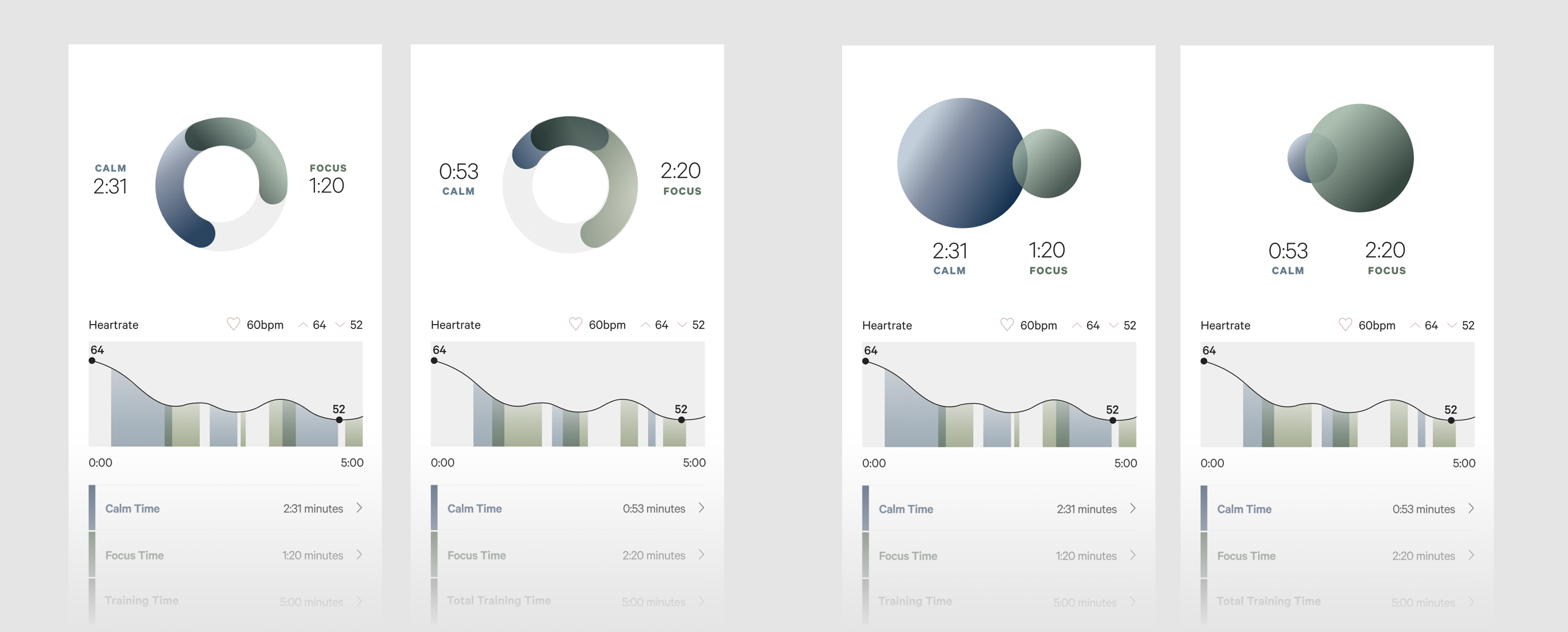
At this point we relied heavily on user testing: first via web on anonymous respondents, then later by running people through a meditation in-person and showing them mockups of their results.
Users were intrigued by more abstract visual approaches (like the "orbs" design above), but struggled to understand their results. More familiar and “goal-oriented” designs were preferred. We also learned that “Calm” and “Focus” made intuitive sense, although users often had questions about how they were derived, and that people really appreciated the grounding effect of seeing their heart rate data.
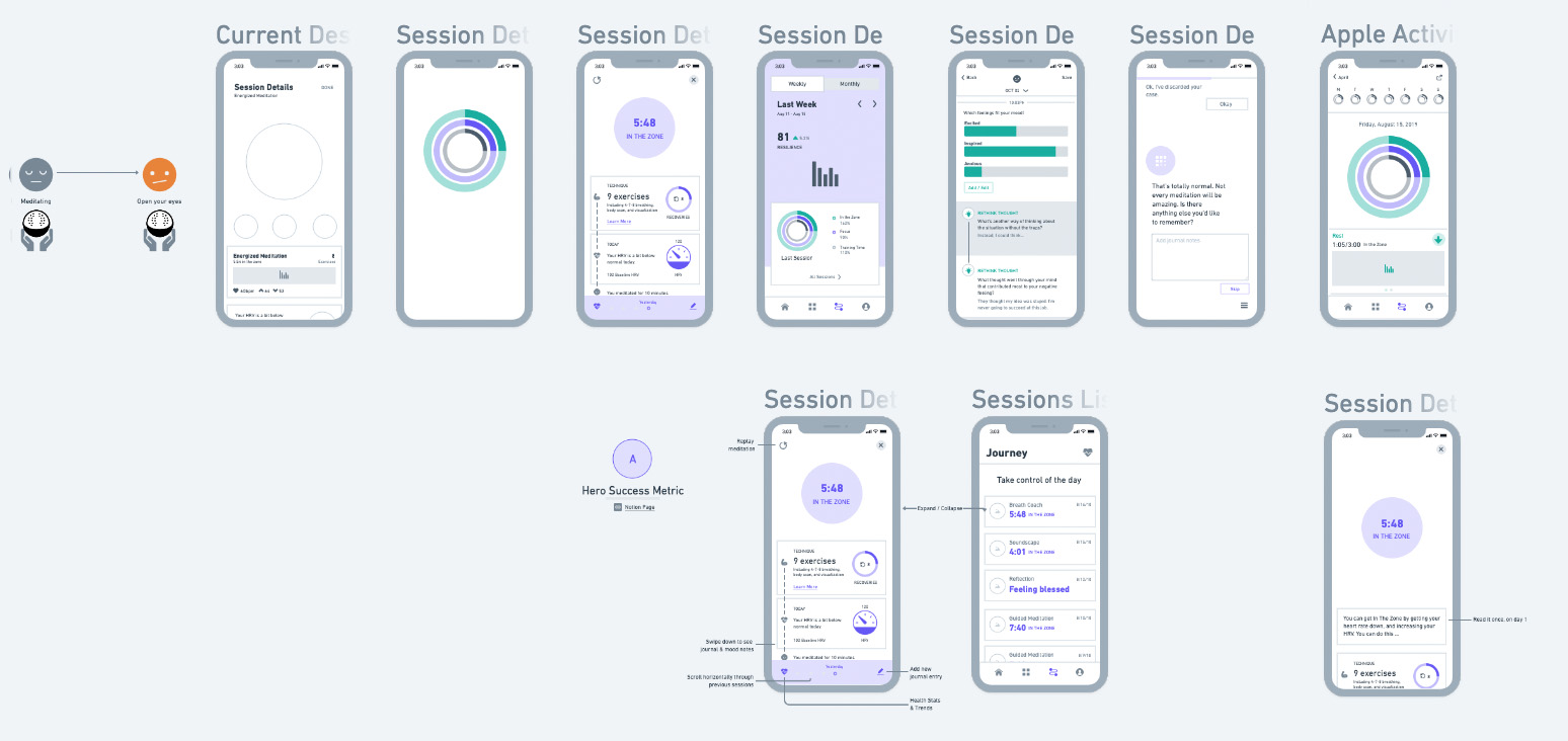
Ultimately, we settled on a design I created that was reminiscent of Apple's activity rings, but with a unique facet: our two primary metrics could overlap in time, giving each session a fairly unique visual signature that could be easily scanned.

The final result was an effective mix of the familiar and the novel, and ended up much-loved by our users. It succeeded in providing the implicit notion of a "goal" (try to fill the ring), while allowing each session summary to have a slightly different character, kept the user grounded by emphasizing heart rate data., and dodged the problem of variability by assessing user performance relative to their own baselines.
