In addition to being able to see the results from their individual meditation sessions, Core app users needed a view of their activity over time. This was essential to making them feel a sense of accomplishment and encouraging them to stick with it -- and it was also an opportunity for us to highlight their change and improvement.
This immediately begged the question: what should we highlight?
We had a variety of different types of data from our users, including:
- Their "Calm" and "Focus" scores (custom metrics derived from heart rate data)
- Their heart rate and HRV data
- The amount of time they'd spent meditating
- The types of meditations and techniques they'd been doing
These things could be displayed in different ways -- per session, as min/max scores, as averages across timeslices of varying lengths...
To tame this tangle of data, we needed an information hierarchy that would highlight some metrics over others. This would implictly tell our users what was most important, so we first had to clarify that for ourselves. We started by crafting some explicit statements about what metrics mattered most, and what improvement should look like.
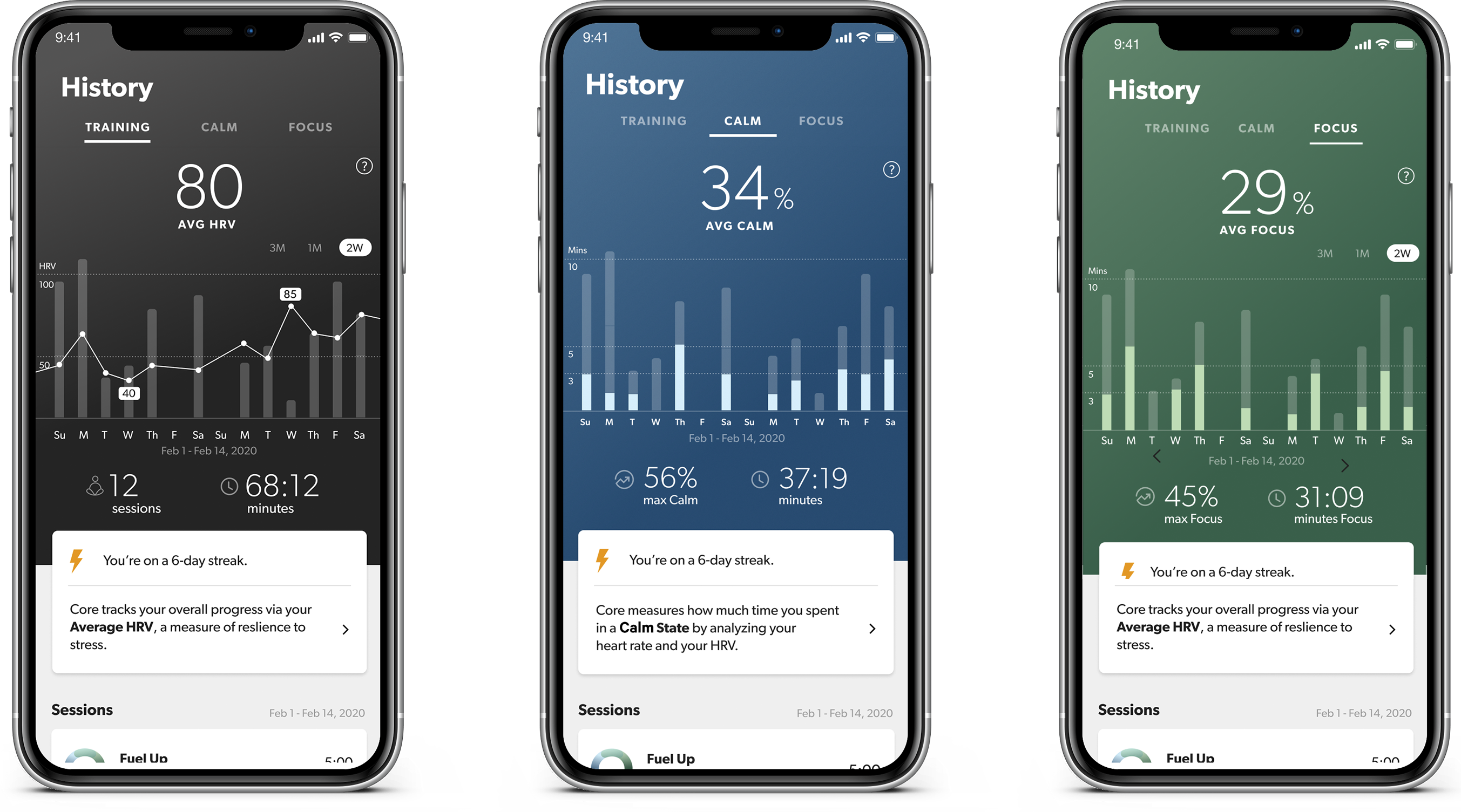
That led us to a three-tab design that reiterated the primacy of the three metrics shown after every single meditation session: the time you've spent (Training), Calm, and Focus. We used color to visually reinforce that the same primary metrics are being shown here, and in your individual session results.
Because we believed that consistency was more important than anything else, we put Training in the primary position. Because evidence showed that HRV can improve via regular meditation practice, we displayed that as the primary metric.
We further emphasized the importance of consistency and "time spent" by using a bar graph that captured your session time totals, and a streak indicator to highlight consecutive days spent meditating.
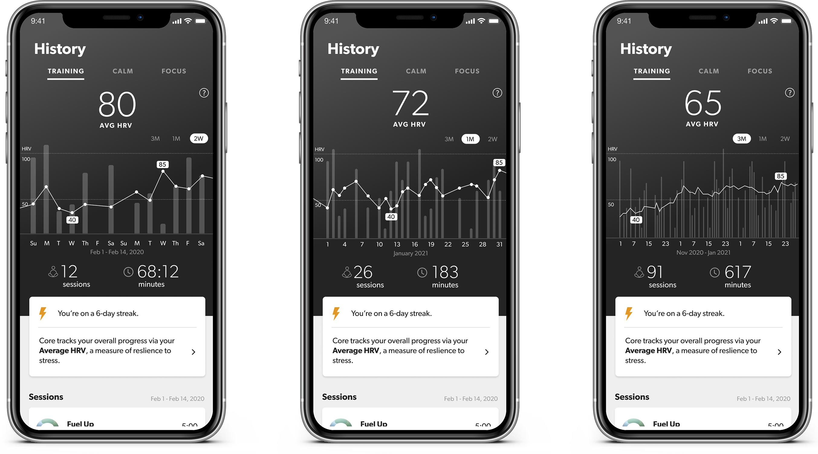
Because all these measures could be calculated and summarized across different timescales, we initially debated what would be most useful to the greatest number of our users (weekly, monthly?) Ultimately we decided on an interactive UI that would allow them to switch between three different timescales.
The result was a UI that was easy to navigate, encouraged users to explore their data, emphasized the most important biometric feedback that Core was providing, and implicitly answered the question that many beginning meditators ask: "How do I know if I'm getting better at this?"
