One of the guiding design principles of the Core app was to minimize the user’s time to immersion. For the user to build a consistent meditation habit, we believed that beginning a session should be frictionless: they should be able to just pick Core up and get started right away.
This approach had already shaped the hardware, which was designed to sit on a visible pedestal, and had no switches or buttons. When it came to the app, we wanted the primary “Home” tab to allow for immediate engagement, too. This came with some challenges:
- We didn't know what kind of meditation the user would want to jump into. There were different types, which potentially appealed to different personas.
- People might be looking for a new meditation, or they could be simply looking to repeat one of their favorites.
- We wanted to try and highlight our “premium” content as much as possible, to motivate users to subscribe, if they hadn't already.
So it was tough to come up with a “one-size-fits-all” approach to the design. One proposal was to allow the users to customize their own Home tab:
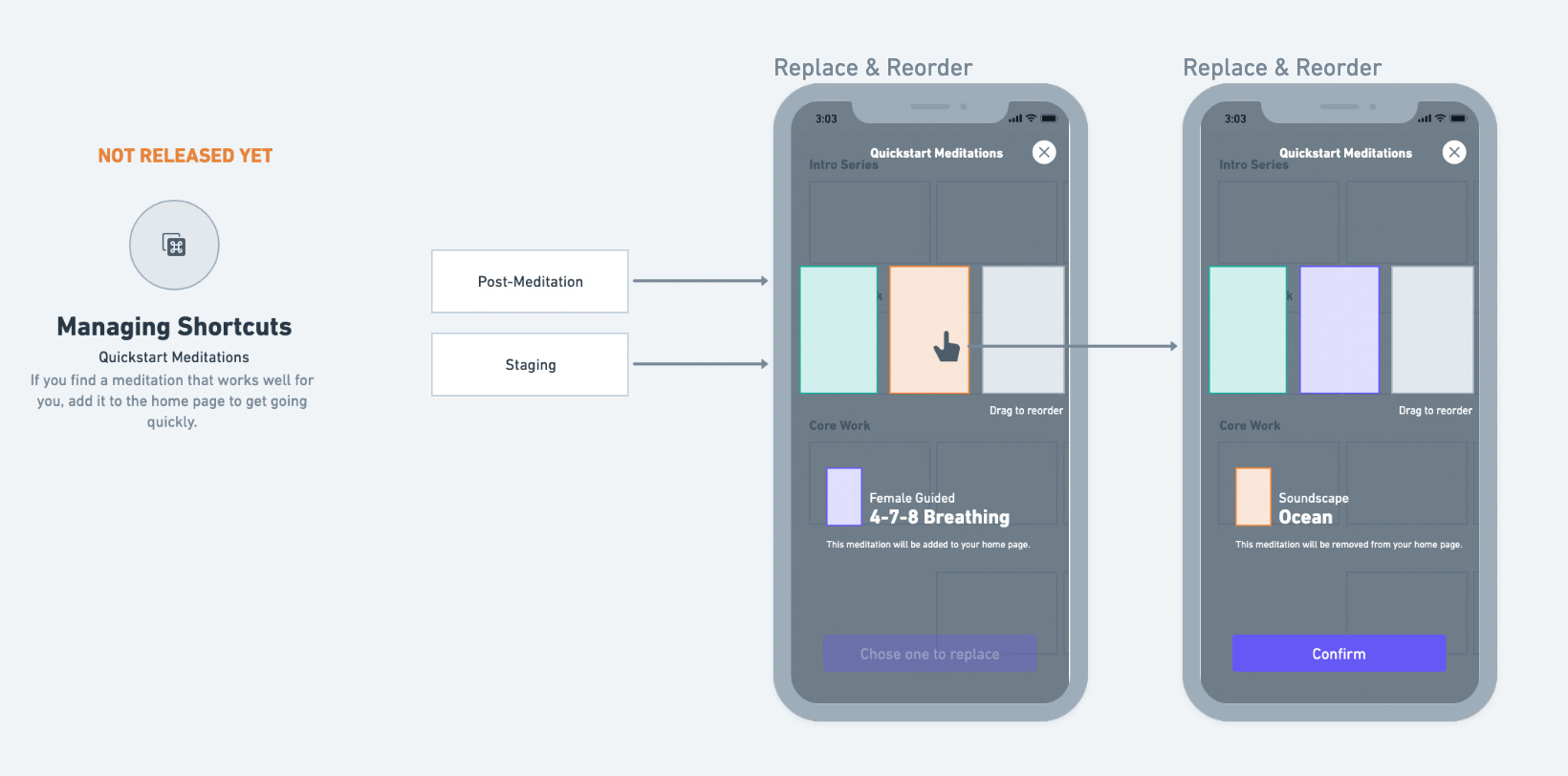
As I experimented with wireframes for this, I worried it was too onerous to constantly manage. And if you stopped managing it, the Home tab became stale -- you'd need to actively explore to find something new (which added friction.)
So instead, I went to our user data to look for insights that might suggest a different approach. Based on behavioral data in Amplitude, I found that users clustered into two groups: some liked novelty -- always looking for a new class or soundscape they’d never heard before. Others were creatures of habit, gravitating back to the same track or two each day.
From our customer support data, I also noted that users sometimes experienced decision paralysis when confronted with the full library of content, browsing for a while before churning without meditating.
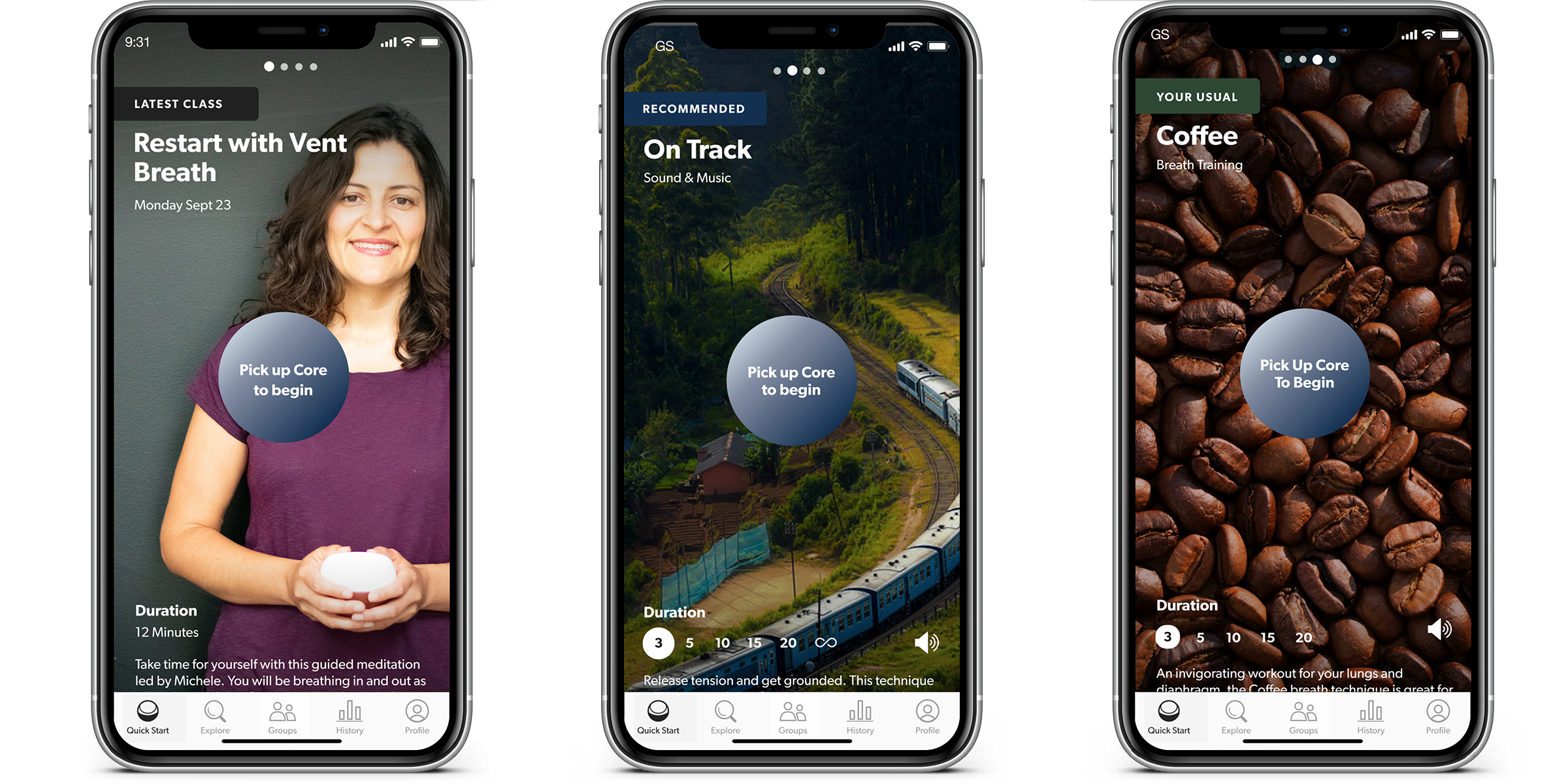
This led me, instead, to a design for a paginated home tab that included logic to dynamically populate with content unique to each user. While it added some complexity to the backend implementation, this complexity was invisible to the user.
The tab always recommend something based on the user's preferred topics and past behavior. If they showed a tendency to return to the same content repeatedly, it would be added to its own dedicated slot ("Your Usual.") If there was a recent piece of subscription content, an additional slot would highlight that for a few days, and more could be added by admins, allowing us to promote content ad hoc basis (i.e. for special partnerships and events.)
This design satisfied our project goals: dynamic personalization struck a balance between different user personas, minimizing time to immersion for both “explorers” and “creatures of habit”, while avoiding the need for users to spend time and effort customizing, giving us a way to highlight premium content, and ensuring the tab didn't get stale.
