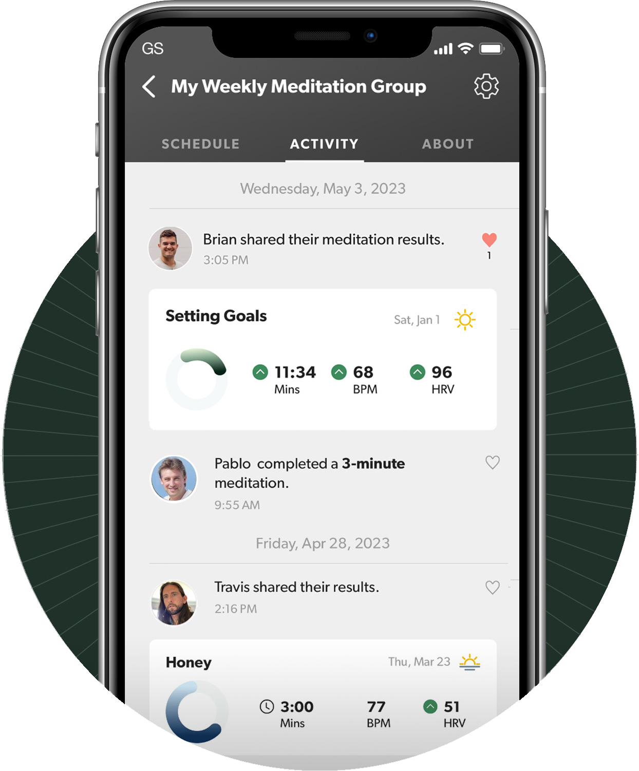
Early on, the founders of Core knew that they wanted the product to have a social layer: user testing revealed that people deeply enjoyed meditating together in a group, then sharing their biometric results.
How we might productize this, though, and what "Groups" might mean within the context of the app, was very much open to debate. We explored ideas ranging from live-streamed meditations, to bluetooth-synched guidance in meditation classrooms, to chat-enabled "waiting rooms", to synchronous sessions where users could view each others' biometric readings in real time.
Many of these ideas ran into hurdles with scope and complexity, or infrastructure requirements, that was beyond our capacity to handle as a startup.
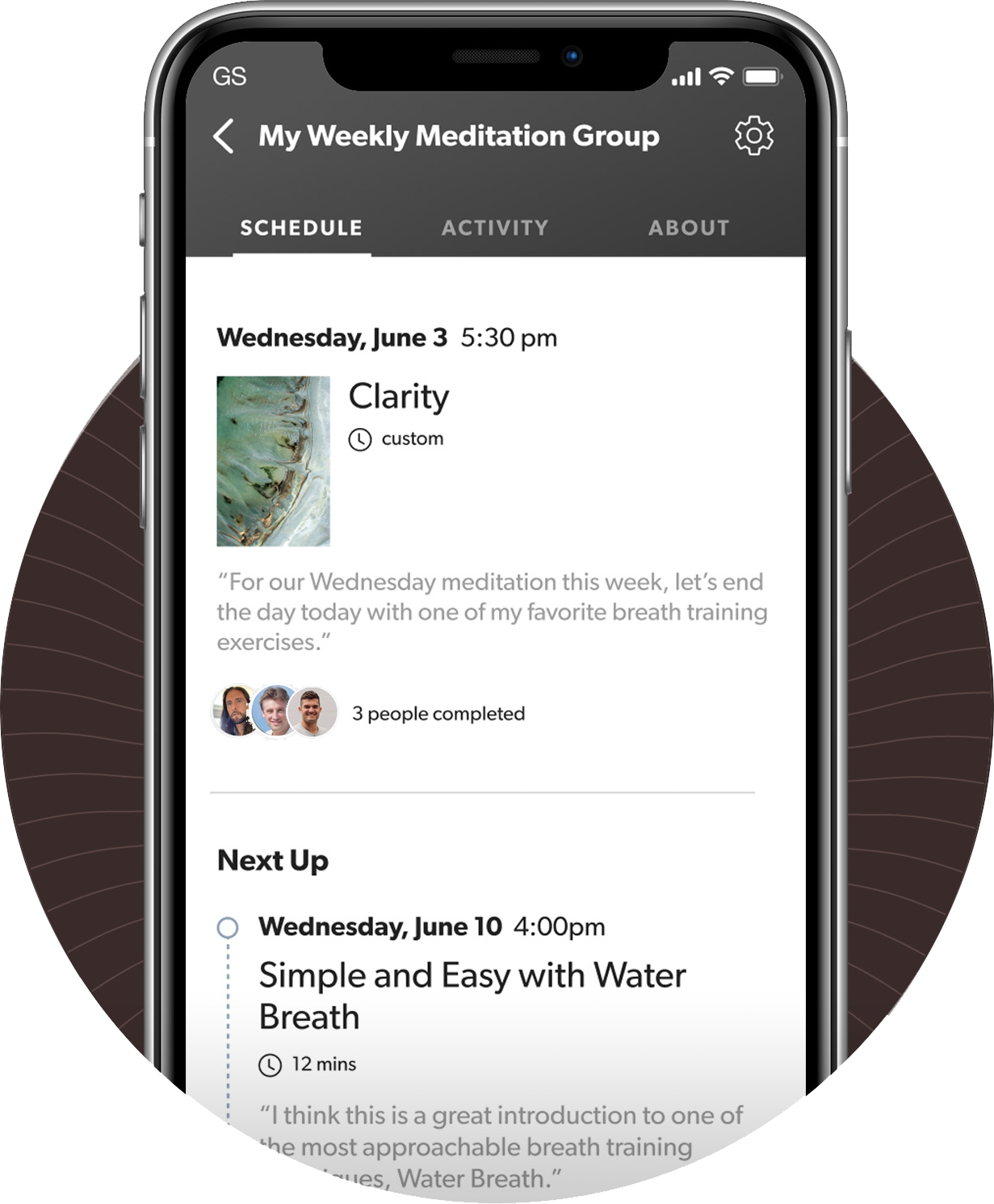
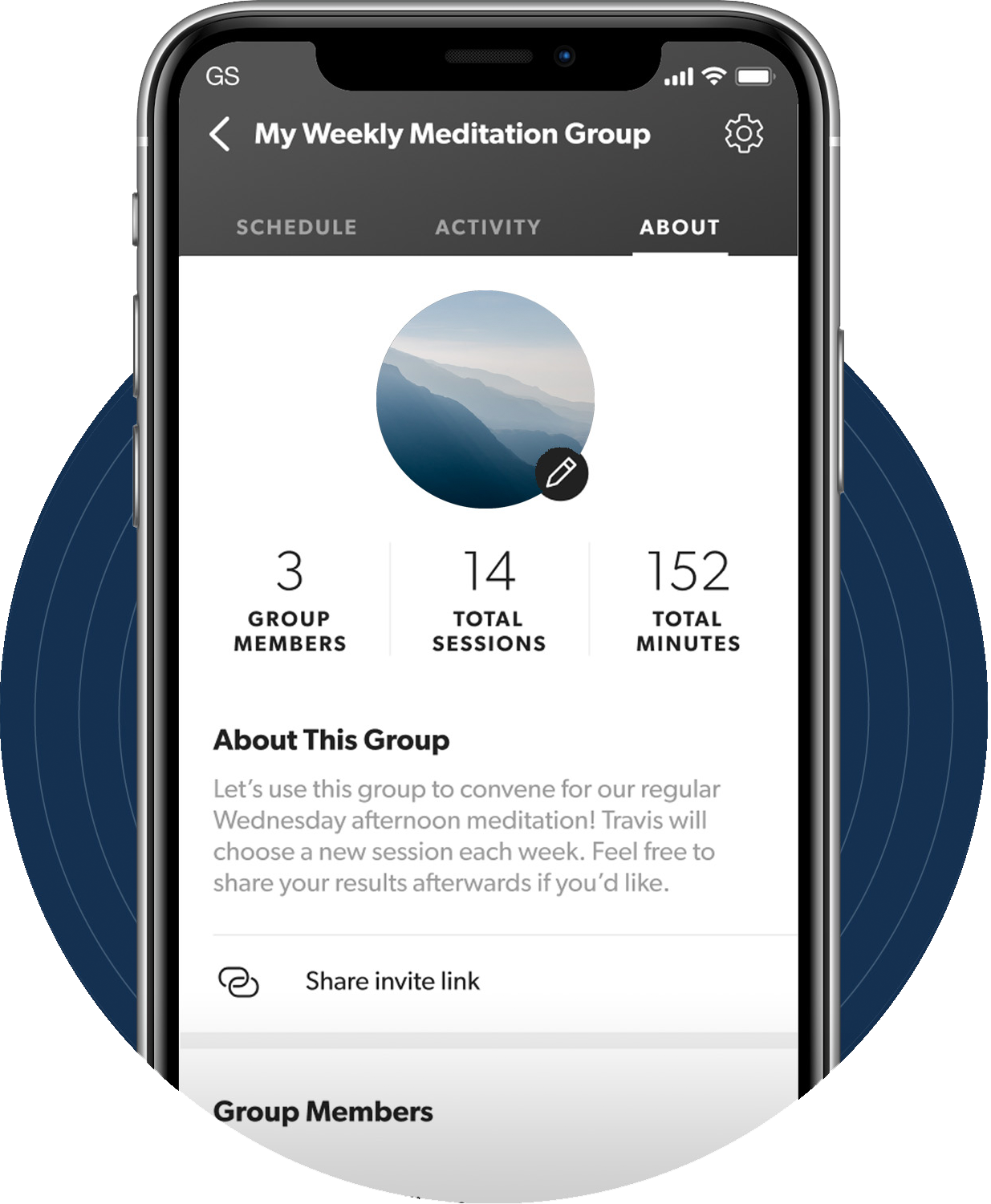
We needed to strip the concept down to something that was feasible to build in a reaosnable timeframe, but still captured the "feeling" of group meditation that had enchanted our early user testers. I did this by paring down to a critical set of user actions (creating and managing a group, inviting members to a meditation, scheduling a calendar of events, and sharing biometric results.)
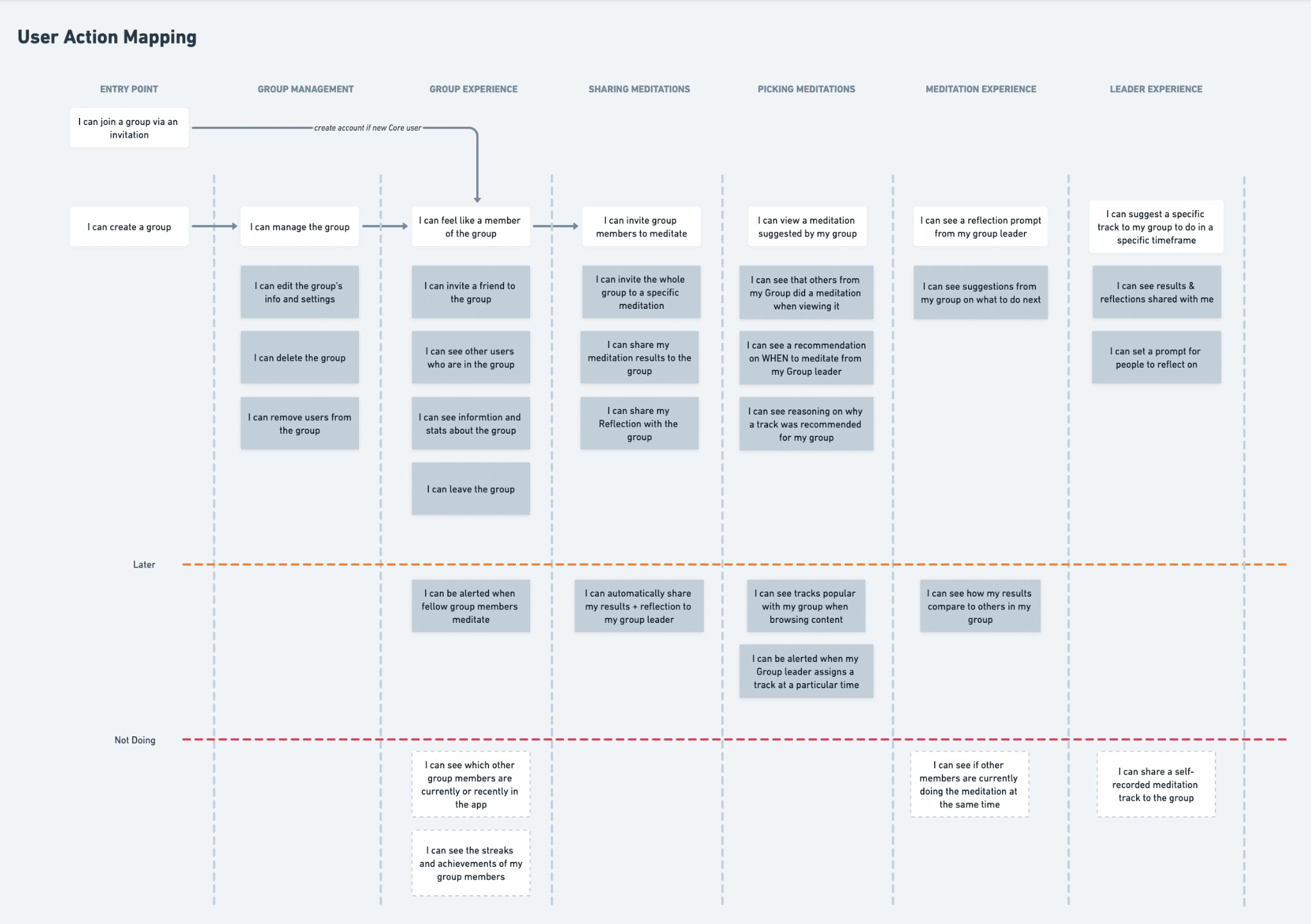
The images I'm sharing here are just screencaps from my Whimsical documents, to give an overall sense of my process. These kind of mapping exercises also helped us stay organized and get an early sense of everything we'd need to design and build.
My belief was that we could achieve our goals without any truly synchronous functionality: the app could create a sense of community, of shared experience, and of interaction without the need for realtime processes like live-streaming, chat, waiting rooms, and so on. This was a big decision requiring a lot of debate, but it drastically reduced the scope of the project.
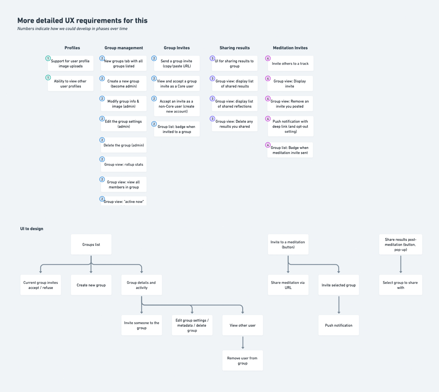
Once we had a map for the actions we wanted to support, we could easily break that down into specific app views we'd need to create. I could begin to think about how we could clump those together into a series of releases that would add functionality incrementally -- allowing us to use and test the feature internally as it grew.
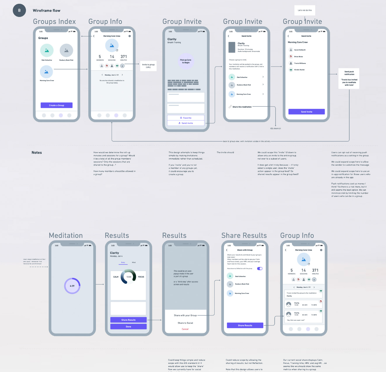
From there, we could move to slightly higher-resolution wireframes for each view.
A lot of iteration happened at this phase, before we even moved to true mockups.
As we settled on a solid design for the Groups feature overall, we were finally able to move to proper Figma designs for each screen, and connect them into simple prototypes that we could play with. This helped us identify points of friction in usability and think of weird edge cases.
Even in this MVP form, building the Groups feature took quite a long time, given the tiny (but hard-working!) developer team that we had. Since we deployed it in multiple, "under the hood" releases, we were able to experiment with it and grant alpha access to additional testers and internal user groups -- this turned out to be incredibly valuable for finding and fixing problems as we went.
The Groups feature finally launched in 2023. While I'd love to offer some data on how it was received and its impact on growth, engagement, and other metrics, I ended up leaving the company not long after its release... but it's good to leave on a high note. :)